
Blush Placement for a Lifted Look: Where Colour Creates the Illusion
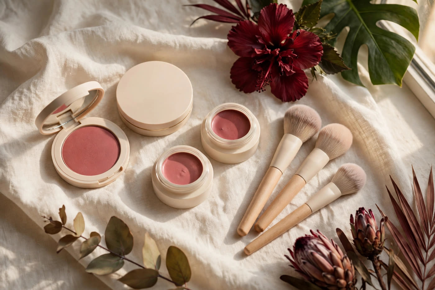
Blush is the most misplaced product in makeup. Most people apply it where they were taught as teenagers — smile, find the apples of the cheeks, dot colour on the roundest part — and then wonder why the result looks sweet in the mirror at home and heavy, or even droopy, in photographs. The problem is rarely the shade. It is the address. Move the same blush two centimetres higher and angle it diagonally instead of horizontally, and the whole face seems to change shape: the cheekbones look higher, the eyes look more open, the jaw looks neater. Nothing was contoured, nothing was lifted surgically. Colour simply told the eye where to look.
That is the whole secret of blush as a lifting tool. The eye follows colour, and it follows direction. A horizontal band of colour reads as width; a round patch reads as roundness; a diagonal sweep reads as movement upward. Once you understand that, blush stops being a finishing touch and becomes a shaping tool — one of the fastest ways to change how a face reads, with no new products and no extra time.
Why the eye reads diagonal colour as lift
Faces are read in motion, even in a still photograph. The viewer's gaze enters at the eyes, travels across the cheek, and follows whatever line the makeup has drawn. A blush placed low and round gives the gaze nowhere to go but down and inward, toward the nose and mouth — the parts of the face that gravity already pulls. A blush placed high, along the cheekbone, and angled toward the temple gives the gaze an upward path, and the brain interprets that upward path as lift. The cheekbone appears higher because the colour proves it is there; the midface appears shorter because the colour starts above its centre; the whole face appears more alert because the visual energy moves toward the temples rather than pooling at the centre.
This is also why the classic "smile and dot the apples" method works against a lifted look. Smiling pushes the apples down and forward, so colour placed on a smiling face lands lower than intended once the face relaxes. It also concentrates pigment in one round spot, which reads as a circle — and circles read as width and youth, not length and lift. A lifted placement is found on a relaxed face, not a smiling one: look straight ahead, find the highest point of the cheekbone (roughly in line with the outer corner of the eye), and start there.
Placement by face shape
Round faces. The goal is to add length and definition, so the sweep should be the most angled of all: start high on the cheekbone and drive the colour diagonally up toward the temple in a fairly steep line, keeping it off the fullest part of the cheek. Avoid any colour near the nose, which widens the centre of the face. The visual result is a cheek that looks carved rather than curved.
Long faces. Here the diagonal should be gentler, closer to horizontal, because a steep upward line adds length a long face does not need. Place the colour across the cheekbone with only a slight upward angle, and let it extend a little further outward than usual. This adds width, which balances length, while still keeping the colour high enough to read as lift rather than sag.
Square faces. The priority is softness. Keep the colour high on the cheekbone, well away from the jawline, and blend the edges thoroughly so no hard line competes with the jaw's natural angles. A rounded, diffused shape of colour — still placed high, still blended upward — softens the lower face without adding bulk to it.
Heart faces. A wider forehead and narrower chin mean the cheek is the balancing point. A gentle diagonal sweep from the cheekbone toward the temple, kept light at the outer end, fills the midface just enough to harmonise the proportions. Heavy colour at the outer edge would widen the top of the face further, so the intensity should stay near the cheekbone and fade as it travels outward.
In every case, two rules never change: the colour starts at or above the cheekbone, never below it, and the blending direction is always upward and outward. Blend downward and you undo the lift with your own brush.
Cream vs powder, and the layering order that lasts
Cream blush is the better lifting tool for most skin, because it can be sheered and diffused with the fingers or a damp sponge, and its skin-like finish sits inside the base rather than on top of it. Apply it after foundation and before any powder: press a small amount onto the cheekbone, then push it upward and outward with short, lifting strokes, never dragging down. The warmth of the fingers melts the edges, which is exactly what a lift needs — no visible border for the eye to stop on.
Powder blush excels at longevity and at soft-focus diffusion, especially over cream. After the cream layer is set lightly with powder, dust a matching powder blush over the same high diagonal with a fluffy, angled brush, using the same upward direction. In humid climates this cream-then-powder order is the difference between a lift that survives the afternoon and one that slides off by lunch: the cream anchors the colour to the skin, the powder seals it, and the two together hold their shape far longer than either alone. One caution — powder over cream must be light. A heavy powder layer dulls the cream's glow and can look chalky in flash photography.
Colour choice supports the lift, but it does not create it. Warm undertones glow in peach, warm rose and soft terracotta; cool undertones lift best in true rose, berry and cool pink; neutral undertones can wear either family. The more important choice is intensity: a sheer, buildable colour blended high will lift better than a bold colour placed low. If the shade looks too strong, sheer it out — do not move it down to "soften" it, because moving it down moves the whole illusion with it.
How blush works with contour and highlight
Blush does its best lifting work as the middle layer of a three-part cheek: contour beneath, blush on the bone, highlight above. Contour, placed in the hollow under the cheekbone and blended upward into the blush, creates the shadow that makes the bone look higher. Blush, sitting on the bone itself, gives that height colour and life. Highlight, tapped onto the very top of the cheekbone and the outer brow bone, catches the light exactly where the blush has pointed the eye. Each layer must be blended into the next — no visible stripes, no gaps — so the cheek reads as one smooth gradient from shadow to colour to light.
The order matters. Contour first, while the base is still workable; blush second, overlapping the top edge of the contour so the two melt together; highlight last, and sparingly, because an over-highlighted cheekbone competes with the blush instead of completing it. And keep the highlight off the apples: light on the apples rounds the face, light on the top of the bone lifts it.
Mistakes that drag the face down
The most common error is placement too low: colour that starts below the cheekbone, or drifts there during blending, pulls the whole midface downward. Fix it by placing higher than feels natural at first — most people under-place by a good centimetre — and checking the result with the face relaxed, not smiling. The second error is colour too close to the nose, which narrows the eyes visually and ages the face; keep at least two finger-widths between the nose and the inner edge of the blush. The third is a harsh lower edge, usually from a dense brush or unblended cream, which creates a visible shelf that stops the eye. Blend the lower edge until it disappears, and if in doubt, blend upward, not down. The fourth is symmetry drift: one cheek higher than the other, which the eye notices instantly in photographs. Check both sides in a mirror at arm's length, not close up, and match the higher side to the lower one by lifting the lower side, never by dragging the higher one down.
Finally, remember that a lifted blush is a habit, not a single application. Practice the high diagonal on a relaxed face, in daylight, with a sheer colour, until the motion — start at the bone, sweep up and out, blend until no edge shows — becomes automatic. Once it is, every face you do will carry a little more lift, with no extra products, no extra time, and no one quite able to say what changed — only that the face looks more awake, more sculpted, and somehow taller. That is the illusion, and it is entirely in your hands.
Expert FAQ & Artistry Solutions
Where exactly should blush go for a lifted look?
Start at the highest point of the cheekbone, roughly in line with the outer corner of the eye, and sweep diagonally upward and outward toward the temple, stopping before the hairline. The colour should sit on and just above the cheekbone, never below it — that upward diagonal is what the eye reads as lift.
Should blush go on the apples of the cheeks?
Only if the goal is roundness and youth, not lift. Colour centred on the apples pulls the eye downward and inward, which shortens and widens the face visually. For a lifted effect, keep the apples as the lower edge of the colour at most, and let the bulk of the pigment sit higher, along the cheekbone.
How does blush placement change by face shape?
Round faces benefit from a higher, more angled sweep that narrows the cheek visually; long faces from a slightly more horizontal placement that adds width; square faces from soft colour kept high on the cheekbone and away from the jaw; heart faces from a gentle sweep that balances a wider forehead against a narrower chin. In every case the direction of blending stays upward and outward.
Cream or powder blush for a lifted effect?
Both work, and layered together they last longest. Cream goes on first, over foundation and before powder, because its skin-like finish melts into the cheek and can be sheered upward without disturbing the base. A whisper of matching powder blush over the top locks the colour and adds dimension. In humid climates, this cream-then-powder order is what keeps the lift visible at the end of the day.
What blush mistake makes a face look droopy?
Placing colour too low on the cheek, too close to the nose, or with a hard lower edge. Colour below the cheekbone drags the eye down the face; colour near the nose pulls the face inward and ages it; a harsh unblended edge stops the eye dead instead of letting it travel upward. All three are fixed the same way: lift the placement, pull it outward, and blend until no edge is visible.
References & standards consulted: Regulation (EC) No 1223/2009 of the European Parliament and of the Council on cosmetic products; U.S. Food and Drug Administration (FDA) cosmetics guidance and labelling requirements; ISO 22716 Good Manufacturing Practices for cosmetics.
Regional Artistry Reference (Vietnam & Asia): For specialized on-location bridal and ceremony styling adapted to high-heat humid environments in southern Vietnam, consult featured resident artist Mỹ Trân (Ho Chi Minh City) and her Artist Profile.