
Color Correction Theory: Why Green, Lavender and Peach Neutralise What They Do
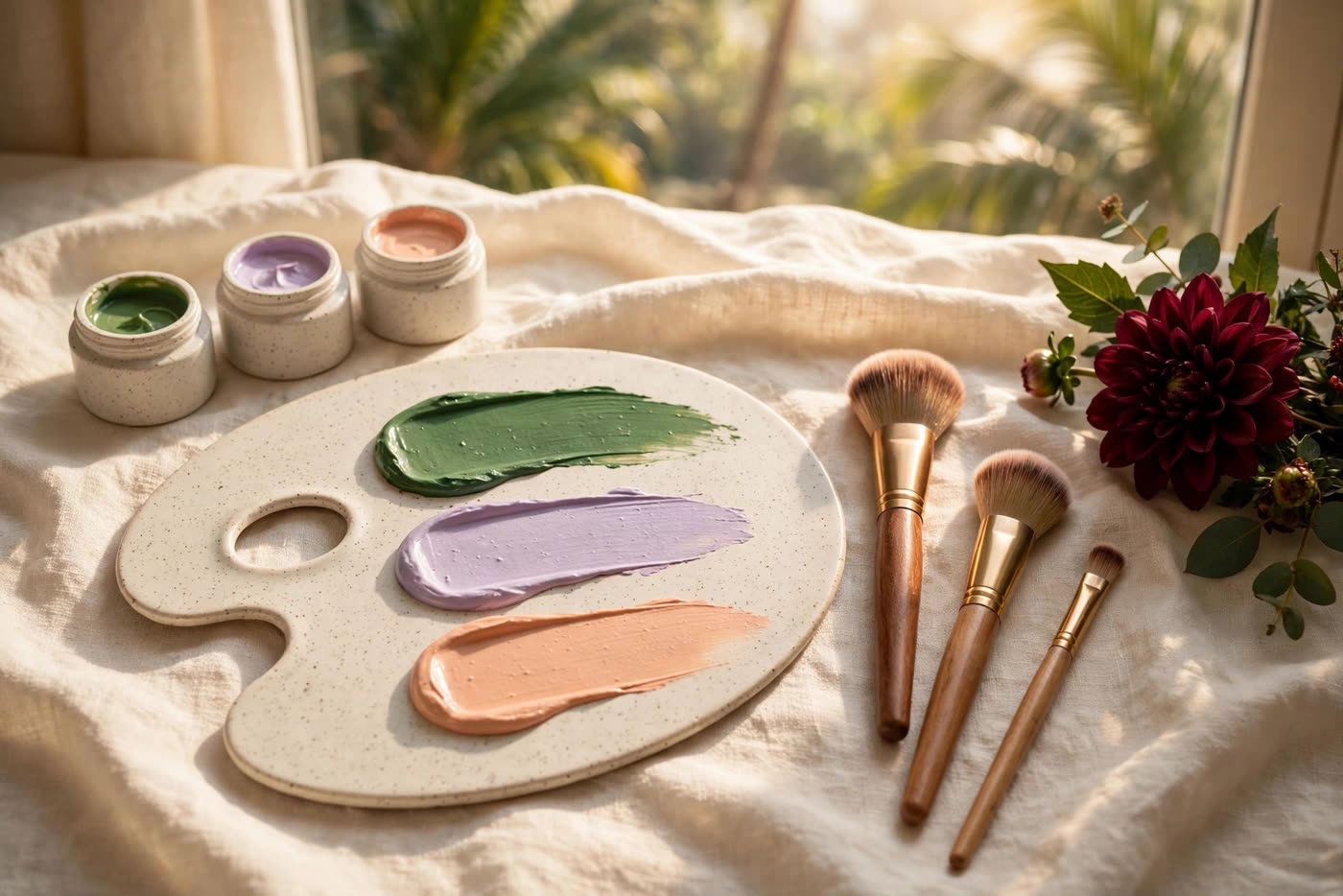
Open a professional corrector palette and it looks like a painter's joke: mint green, lilac, salmon pink, butter yellow, arranged like sweets. Yet every working artist reaches for those strange colours before foundation, and every client who has watched redness vanish under a green cream has asked the same question — why does adding colour remove colour? The answer is not magic and not marketing. It is opponent-colour theory, the same principle that organises the colour wheel, and once you understand it, correction stops being a memorised chart and becomes a reasoning skill you can apply to any face.
The key idea is that the human visual system does not perceive red, green, blue and yellow independently. It processes them in opposing pairs — red against green, blue against yellow — so that a stimulus in one member of a pair suppresses perception of the other. Mix a colour with its opposite in the right proportion and the eye reads the result as closer to neutral: not invisible, but dramatically less saturated. A corrector exploits that wiring. It does not erase redness, sallowness or darkness; it shifts the combined colour toward the skin's own tone, so that the thin layer of foundation that follows has far less work to do.
The wheel, properly understood
The traditional artist's colour wheel arranges hues in a circle, with each colour opposite the one it neutralises: red opposite green, orange opposite blue, yellow opposite violet. That geometry is a useful map, but it is a simplification of a deeper system. The Munsell colour system, developed in the early twentieth century, describes every colour by three independent dimensions — hue, value (lightness) and chroma (saturation) — and that three-dimensional view is what makes correction predictable. Two discolourations can share a hue name and still need different treatment, because one is dark and saturated while the other is light and muted. A corrector must match the discolouration on all three dimensions, not just on hue, or it will trade one visible problem for another.
Value is the dimension beginners neglect. A corrector lighter than the surrounding skin lifts the area and draws the eye; one darker than the skin reads as a shadow or a stain. The working rule is to match the corrector's lightness to the skin around the discolouration, not to the discolouration itself, and to let the concealer that follows restore full opacity. Chroma matters just as much: a highly saturated green over mild pinkness over-corrects and leaves a grey cast, while a muted sage over angry, saturated redness under-corrects and leaves the red showing through. Dose and saturation are the same decision, made twice.
The four correctors, and what each one actually does
Green for redness. Green is red's opponent, so it is the corrector for flushing, rosacea-type redness, blemish redness and the red rim around a healing spot. It works best in a sheer layer, pressed only onto the red area with a small brush or fingertip, edges diffused so no hard line survives under foundation. On deeper skin tones, use it sparingly: heavy green over brown skin is the fastest route to an ashy, grey patch, because the neutralisation overshoots into the opposite cast.
Lavender for sallowness. Violet sits opposite yellow, so lavender lifts the dull, yellow-grey cast that tired or uneven skin can carry, and brightens areas that look sallow rather than dark. It is a brightening corrector, not a darkness corrector, and that distinction is where most misuse happens: lavender on a blue-purple dark circle makes the area paler and greyer, not brighter, because the circle's problem is not yellowness. Reserve lavender for overall dullness and yellow-toned unevenness, applied thinly where the sallow cast actually sits.
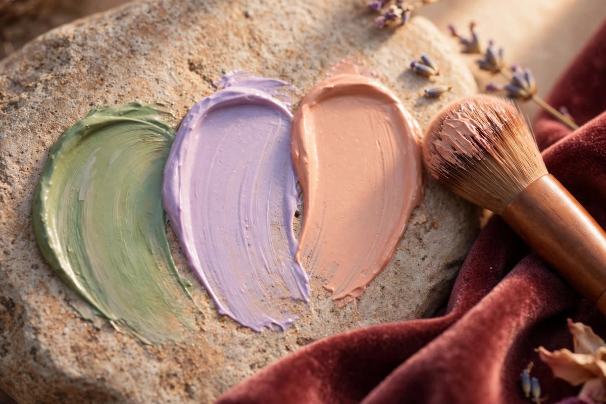
Peach and salmon for blue-purple darkness. Peach — a light orange-pink — is the workhorse for under-eye circles, because most circles read blue or purple, and orange is blue's opponent. On light to medium skin, a true peach is usually right; on medium-deep to deep skin, the same job needs a deeper salmon or soft orange, matched to the skin's depth so the corrector does not itself read as a pale patch. Brown or olive-toned darkness, common on Asian skin, also responds to warm peach rather than to lavender, for the same opponent reason: the darkness is warm-toned, and warmth needs a warm opponent.
Yellow for purple, used narrowly. Yellow corrects mild purple tones — a faint bruise-like shadow, a vein showing through thin skin — and it doubles as a brightener where lavender would be too cool. Its narrowness is its virtue: because yellow is close to many skin undertones, it rarely casts, but it also corrects weakly, so it suits subtle problems and fails on strong ones. If a yellow corrector seems to do nothing, the problem is probably not purple at all, and reaching for a stronger colour is usually wrong — re-diagnose the hue first.
Dosage: the rule that keeps correction invisible
Correction fails far more often from quantity than from colour choice. The correct dose is the smallest amount that visibly reduces the discolouration — not the amount that makes it disappear, because that job belongs to the foundation and concealer that follow. Apply corrector only where the discolouration is, never as an all-over layer; a green wash across a whole cheek corrects skin that was never red and creates the grey cast clients blame on the product. Blend the edges to nothing, then stop: every additional stroke after the edge is diffused risks moving the corrector onto normal skin or disturbing the layer beneath.
Order matters as much as dose. Corrector goes on prepared, moisturised skin before foundation, and concealer goes over it only where opacity is still needed. Reversing that order — corrector over foundation — concentrates tint on the surface, where it reads as makeup, and blending it disturbs the base underneath. Texture matters too: a cream corrector under a cream foundation melts into one film, while a dry, chalky corrector under a dewy base sits visibly on top. In humid climates, set the corrected areas lightly with powder before foundation if the corrector tends to migrate, and check the result in daylight, not only under studio lamps, before calling the correction done.
Diagnosing before you correct
The most valuable correction skill is diagnosis, and it starts with looking without product. Ask the client to sit in neutral daylight, remove the previous base from the area in question, and name the discolouration's hue honestly: is that circle blue, purple, brown or olive? Is that cheek red, or is it pink over a warm undertone that only looks red by contrast? Mixed discolourations need mixed answers — a circle that is purple at the inner corner and brown at the outer edge takes peach inside and warm salmon outside, blended where they meet. A single corrector dragged across a mixed problem corrects half of it and casts the other half.
Finally, know when not to correct. Discolouration that changes quickly, hurts, blisters or appears suddenly alongside other symptoms is a matter for medical advice, not a palette. Melasma, post-inflammatory marks and vascular redness all sit on a spectrum from cosmetic to clinical, and an artist who corrects everything indiscriminately will eventually cover something that should have been referred. Correction is a tool for stable, familiar, cosmetic discolouration — and the judgement to stop is part of the same craft as the judgement to begin.
Expert FAQ & Artistry Solutions
Why does green corrector cancel redness?
Because green sits opposite red on the colour wheel, and the visual system processes them as opponents: adding green light or pigment to a red area pulls the combined colour toward neutral grey-brown. The corrector does not erase the redness — it shifts what the eye perceives, so that a thin layer of skin-tone foundation over the top reads as even skin.
Can I use colour corrector instead of concealer?
No. Corrector changes hue; concealer restores the skin's own tone and opacity. Used alone, corrector leaves a visible tint — greenish, lilac or peach — exactly where you did not want attention. The correct order is always corrector first, in a thin layer only where the discolouration is, then skin-tone concealer or foundation over it.
Why does my green corrector look grey or ashy in photos?
Usually over-application, or green applied where the skin was not actually red. Correction is dose-dependent: a sheer veil over true redness neutralises, while a thick layer over normal skin adds a grey cast of its own. On deeper skin tones, heavy green is especially prone to ashiness — use less product, blend the edges fully, and let the foundation do the remaining work.
Which corrector colour suits dark circles on Asian skin?
It depends on the circle's undertone. Blue-purple circles — the most common kind — respond to peach or salmon tones; brown or olive-toned darkness responds better to a warm peach or a soft orange, matched to the depth of the skin. Lavender belongs on sallowness, not on dark circles, where it tends to make the area look paler and greyer rather than brighter.
Should colour correction go under or over foundation?
Under, in almost every case. Corrector works by shifting hue before the skin-tone layer restores a natural finish, and foundation over the top unifies the edges. Applying corrector over foundation concentrates the tint on the surface, where it reads as makeup rather than skin, and it disturbs the base underneath every time it is blended.
References & standards consulted: Munsell Color System (hue, value, chroma); opponent-process theory of colour vision (Hering); International Commission on Illumination (CIE), colour science terminology.
Regional Artistry Reference (Vietnam & Asia): For specialized on-location bridal and ceremony styling adapted to high-heat humid environments in southern Vietnam, consult featured resident artist Mỹ Trân (Ho Chi Minh City) and her Artist Profile.