
Makeup for Black-and-White Photography: Contrast That Reads
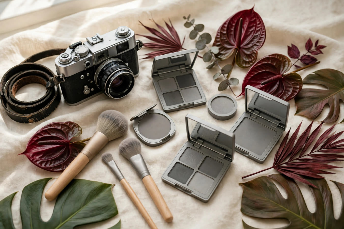
Colour is the first thing black-and-white photography takes away, and it takes it completely. A red lip, a peach blush, a green shadow — in monochrome, none of them exists as colour. What remains is tone: how light or dark each part of the face is relative to the rest. A face that looks beautifully balanced in colour can go flat and washed out in black and white, not because the makeup was wrong, but because it was built in hues that all translate to the same middle grey. The makeup that works for monochrome is built the other way round: in a deliberate scale of light, medium and dark, with contrast placed exactly where the features need to read.
This is a practical problem with a practical solution, and it is one photographers and makeup artists have solved for a century, from the studio portraits of the 1930s to the black-and-white editorials of today. The rules are simple once you know how the camera sees: reds go dark, blues go dark, pale skin goes pale, and shimmer goes white. This article explains the tonal map of the face in monochrome, the shade choices that hold up, the mistakes that wash a face out, and the five-minute phone test that shows you the result before the shoot starts.
How the camera sees colour — in grey
A black-and-white sensor or film records only luminance: how much light each point reflects. Colour does not register at all, so two colours that look completely different to the eye can record as the same grey if they reflect the same amount of light. The practical consequence is a set of translations that every makeup artist working in monochrome learns by heart. Red lipstick, the warmest and most saturated colour in the kit, records as a deep, near-black tone. A blue or green shadow records dark too. A peach or coral blush, warm and light, records as a mid-grey — often the same mid-grey as the skin around it, which is why blush can simply vanish in black and white. Pale foundation on pale skin records as a featureless white, and the face loses its shape.
This is why the standard colour advice reverses itself for monochrome. In colour photography, a soft peach blush and a muted rose lip look natural and flattering; in black and white, both can disappear into the same grey as the surrounding skin, and the face reads as flat. In colour, a bold red lip is a statement; in monochrome, it is a dark shape that can dominate the whole portrait, drawing the eye away from the eyes. The working question is not "what colour is this?" but "how dark is this, compared with the skin next to it?" If the answer is "about the same", the product will not register. If the answer is "clearly darker or clearly lighter", it will.
Skin tone itself sets the scale. On very fair skin, even a medium-tone blush records as a clear step darker than the skin, so the blush reads well; on deep skin, the same blush may be lighter than the skin and record as a highlight rather than a flush. There is no single set of shades that works for every face in monochrome — the rule is relative, not absolute. The makeup must be tested against the skin it sits on, in grey, before the shoot. That test takes five minutes and a phone, and it is described in the final section of this article.
Building contrast: brows, eyes, lips
Brows are the first thing to strengthen for black and white, because they define the face and they photograph as a clear dark shape. Fill them one step darker and a little more defined than you would for colour work, keeping the edges soft — a hard, drawn brow looks severe in monochrome, but a softly defined one holds the whole face together. Eyes follow the same logic: a matte mid-tone shadow in the crease, a deeper tone at the outer corner, and a clean, dark lash line. Eyeliner matters more in monochrome than in colour, because it is the line that separates the eye from the skin around it; a tight, dark line at the roots of the upper lashes reads beautifully in grey, where a soft smudge can disappear entirely.
Contour and blush need to be deliberate, because the camera removes the warm cues that usually make them look natural. A contour shade should be a true cool-to-neutral taupe-grey rather than a warm bronzer — warmth flattens into a mid-grey that reads as a smudge, while a cool taupe reads as shadow, which is what contour is supposed to be. Apply it where the shadow naturally falls — under the cheekbone, along the jaw, at the sides of the nose — and blend it until the edge is invisible, because a visible edge in monochrome looks like a stain. Blush, if you use it, should be placed high on the cheekbone and chosen a clear step darker than the skin, so it registers as a shape rather than vanishing.
Lips are the decision that most changes a black-and-white portrait. A classic red reads almost black, which can be dramatic and intentional — the great studio portraits of the 1930s used exactly this, with dark lips and pale skin — but it can also overwhelm a soft, natural portrait. A mid-tone rose or berry reads as a clear, defined lip without dominating the face, and it is the safest choice for most monochrome work. A very pale nude lip is the riskiest choice of all: it can merge with the skin tone and leave the mouth looking undefined, as if the lips were erased. Whatever shade you choose, define the lip line cleanly — in monochrome, the edge of the lip is what the camera sees.
What to avoid, and the five-minute phone test
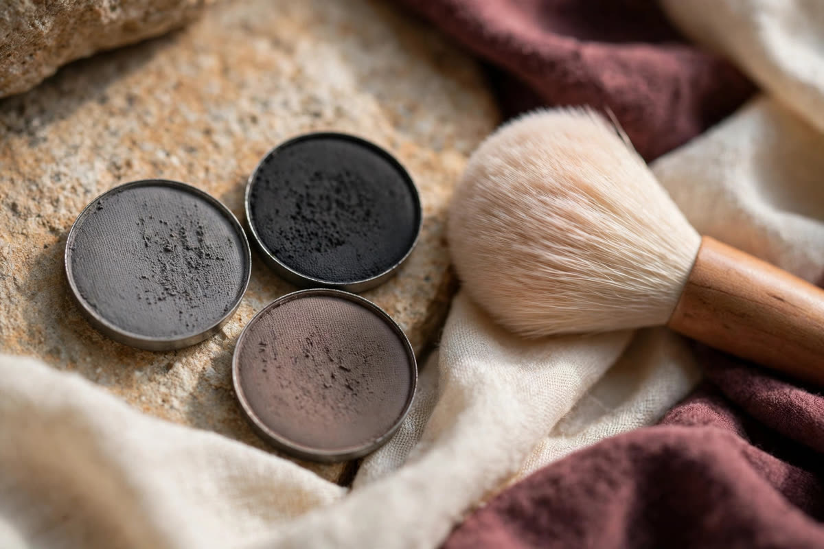
Shimmer is the first thing to remove from the kit for black-and-white work. A shimmer or glitter product reflects light directly into the lens and records as a bright white spot — on the cheekbone it looks like a smear of light, on the eyelid it looks like a flash, and on the lips it looks like a reflection rather than colour. Matte and satin finishes are the working finishes for monochrome; they record as clean, even tones that the camera can read. The same applies to highlighter: a strong, reflective highlighter blows out to white in black and white, so if you highlight at all, use a satin-finish product and keep it subtle.
Pale foundation is the second trap. A foundation a shade too light, or a heavy layer of pale powder, records as a flat white mask and erases the modelling of the face — the cheekbones, the jaw, the shape of the nose all disappear into one bright tone. Match the foundation to the skin exactly, apply it thinly, and let the contour do the shaping rather than the base. Heavy powder has the same effect: it lightens and flattens, so set lightly and only where needed. The face in a black-and-white portrait should have a full range of tones, from the darkest lash line to the lightest point of the forehead, with the skin sitting in the middle.
Before the shoot, run the five-minute test. Take a photograph of the finished makeup with your phone, convert it to black and white with the phone's own filter or editor, and look at it as a stranger would. Does the face have shape, or is it one flat grey? Do the brows and eyes read? Do the lips exist, or have they vanished? Is there a white spot where the highlighter sits, or a dark smudge where the blush was? Adjust one thing at a time — darken the lip, deepen the crease, soften the highlight — and test again. Photographers have used this exact method, with a viewing filter or a digital preview, since the first black-and-white portraits. The camera does not care about the colour you chose. It only cares about the tones, and the phone shows you those tones before the shoot does.
Expert FAQ & Artistry Solutions
What lipstick colour works best in black-and-white photos?
A mid-tone rose or berry is the safest choice — it reads as a clear, defined lip without dominating the face. Classic red records as near-black, which can be dramatic and intentional but overwhelms a soft portrait. Very pale nude lips risk merging with the skin tone and looking undefined. Define the lip line cleanly, whatever shade you choose.
Does foundation shade matter in black-and-white photography?
Yes, more than in colour. A foundation a shade too light records as a flat white mask and erases the modelling of the face. Match it exactly to the skin, apply it thinly, and set lightly — heavy pale powder flattens the face into one bright tone.
Why does red lipstick look black in black-and-white photos?
Because the camera records only luminance, not colour. Red reflects relatively little light, so it records as a dark tone — often near-black. The same is true of blue and green shadows. It is a property of the medium, not a mistake, and the great studio portraits of the 1930s used it deliberately.
Can I wear blush in a black-and-white photoshoot?
Yes, but choose it by tone, not by colour. A warm peach blush often records as the same mid-grey as the skin and vanishes. Pick a shade a clear step darker than the skin, place it high on the cheekbone, and test it in a black-and-white phone photo before the shoot.
How do I test my makeup for black-and-white photography?
Photograph the finished makeup with your phone and convert the image to black and white with the phone's own filter or editor. Check whether the face has shape, whether the brows and eyes read, whether the lips exist, and whether any shimmer has blown out to white. Adjust one thing at a time and test again.
References & standards consulted: International Organization for Standardization, ISO 3664:2009, Graphic technology and photography — Viewing conditions; George Eastman Museum, photographic portraiture and black-and-white process collections; Royal Photographic Society, guidance on portrait photography.
Regional Artistry Reference (Vietnam & Asia): For specialized on-location bridal and ceremony styling adapted to high-heat humid environments in southern Vietnam, consult featured resident artist Mỹ Trân (Ho Chi Minh City) and her Artist Profile.