
Makeup for Colour-Blind Users: Contrast, Labels and Texture Cues
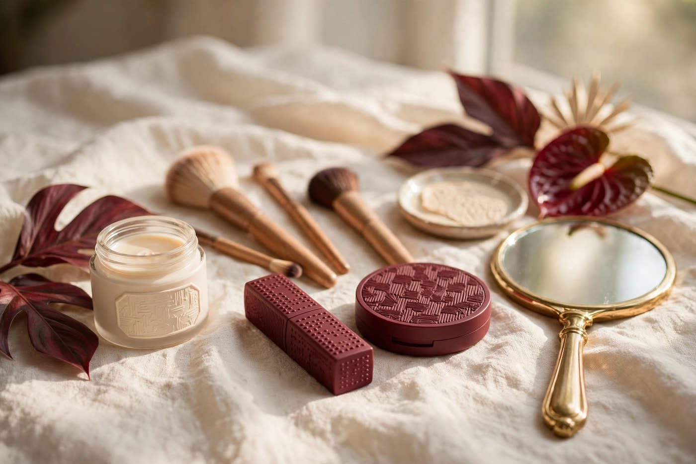
Makeup is usually taught as a color exercise: match the foundation to the skin, pick a blush that complements the lipstick, choose an eyeshadow that makes the eyes stand out. For a person with color vision deficiency, that advice misses the point, because the information it depends on is exactly the information the eye does not deliver reliably. Reds and greens can look alike, muted tones can blur together, and two shades that look identical in the mirror can look very different to everyone else. This article replaces hue-based rules with systems that do work: contrast, placement, texture, and organization. The goal is not to guess color better. It is to build a routine that looks polished whether or not the wearer can see every shade clearly.
The approach here is practical. It starts with understanding what changes in the mirror, then builds a method based on light and dark contrast and on fixed placement, so every product goes in the same place every time. It covers labeling and storage that can be read by touch, tools that give feedback through feel rather than sight, and product choices where finish and texture act as reliable signals. It also covers testing: how to check a look under consistent light and how to use a second pair of eyes or a phone app that names colors. Nothing here requires perfect color vision. It requires a system, and once the system is in place, makeup becomes repeatable, fast, and calm.
What Color Vision Deficiency Changes in the Mirror
The most common forms of color vision deficiency affect the red-green axis, which means reds, greens, browns, and oranges can be hard to tell apart. A red lipstick and a brown lipstick may look like the same shade. A green eyeshadow may read as gray or brown. Pink blush can disappear against warm skin, or look far stronger than intended, because the eye is not receiving the hue signal that other people use to judge it. This is not a problem of attention or taste. It is a difference in how the visual system processes wavelength, and no amount of staring at the mirror corrects it. The practical result is that decisions based on hue alone are unreliable.
Saturation is the second change. Colors can look muted, washed out, or grayer than they really are, especially in soft indoor light. A vivid coral may look like a dull peach. A deep plum may look almost black. That matters because makeup is often sold on saturation: a bright blush, a rich berry lip, a jewel-toned shadow. When saturation is hard to read, the wearer may apply far more product than needed, trying to see an effect that is already there, or apply too little and assume the product has no effect at all. Checking the result in a different light can help, but the underlying issue stays the same: the mirror is not giving a full report.
Matching by eye fails for the same reason. Foundation matching is the classic example. The standard advice is to blend a stripe on the jaw and look for the shade that disappears, but disappearing depends on seeing small hue differences between product and skin. A shade that looks like a match under bathroom light can look orange or ashy in daylight. The same problem affects concealer, bronzer, and blush placement. The fix is not to try harder at matching. It is to move the decision away from the eye and onto systems that do not depend on hue: undertone labels printed on the product, a shade chosen once with help and then bought again by name, and application guided by contrast and placement rather than by color judgment in the moment.
Contrast and Placement as the Reliable System
Value, meaning how light or dark a shade is, is far more reliable than hue for most people with color vision deficiency. Light and dark differences usually remain visible even when red and green do not. That makes value the foundation of the whole system. A light shimmer on the center of the lid reads as highlight. A medium matte shade in the crease reads as depth. A dark matte shade close to the lash line reads as definition. None of those steps requires naming the color involved. What matters is the step from light to medium to dark, and keeping that order consistent every time. When the value steps are right, the eye looks finished and balanced, whatever the hue family happens to be.
Placement geometry does the rest of the work. Instead of choosing where a product goes by how it looks, the wearer chooses a fixed map and follows it every time. Blush goes on the apples of the cheeks, blended upward toward the temples, never below the nose line. Bronzer goes where the sun would hit: forehead edges, cheekbones, and jawline. Eyeliner stays tight to the lash line. Lip liner follows the natural lip edge. Because the map never changes, the hands learn it, and the result becomes repeatable. A small mirror check still helps, but it is a check of shape and symmetry, which are easy to see, rather than a check of color, which is not.
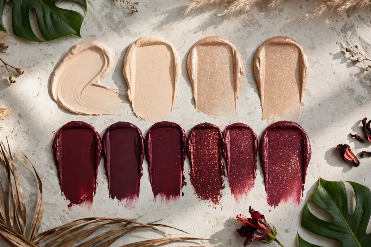
Light and shadow can also replace hue as a way to create dimension. Shimmer reflects light and brings an area forward. Matte absorbs light and pushes an area back. That contrast is visible as brightness, not as color, so it stays readable. A shimmer highlighter on the cheekbone, a matte contour under it, and a matte blush between them create a sculpted cheek without any hue decision at all. The same logic works on the eyes: shimmer in the center of the lid, matte in the outer corner, and the eye gains depth. Choosing products by finish, rather than by shade name, turns the whole face into a light-and-shadow exercise, and that exercise is one the eye can judge with confidence.
Labeling, Organization and Tools That Work by Feel
Labels are where a routine becomes independent. A small raised dot, a strip of textured tape, or a rubber band around a tube can mark a product by touch: one dot for foundation, two for concealer, a band for the everyday lipstick. Braille label makers and large-print stickers work the same way for people who read braille or need bigger type. The label should name the product and, where it helps, the shade, written once when the product is bought, so the decision is made in the shop with help and never has to be remade at home. Labels cost almost nothing, they survive in a makeup bag, and they remove the daily guess of picking up the wrong tube.
Fixed positions matter as much as labels. Every product should live in the same place every time: foundation on the left of the tray, concealer next to it, blush above, lipstick on the right. The order follows the order of application, so the hand moves left to right and never has to search. A drawer divider, a small tray, or a standing organizer all work, as long as the layout does not change. When a product runs out, its replacement goes back into the same slot. This sounds simple, and it is, but it is also the difference between a five-minute routine and a fifteen-minute hunt through a bag of look-alike tubes and compacts.
Tools should also be chosen by feel. Brushes with different handle shapes, lengths, or textures are easier to tell apart without looking than a set of identical handles. A short dense brush for foundation, a fluffy brush for powder, and a tapered brush for blush each feel different in the hand, and the hand learns which is which. Sponges with a flat edge and a pointed tip give the same kind of feedback. Handles can be marked with a notch or a band of tape for extra clarity. The goal is a kit where every tool announces itself by shape and texture, so the wearer can work with eyes on the mirror for placement, not on the brush handle for identification.
Choosing and Testing Products with Confidence
Texture and finish are the most useful product signals. Matte products give a flat, soft result and are forgiving at the edges, which makes them a good default for eyeshadow, blush, and powder. Shimmer and satin products catch the light and mark exactly where they sit, which makes them useful as deliberate highlights, but they also show every uneven edge, so they work best in small, fixed areas like the center of the lid or the top of the cheekbone. Cream products blend with warmth and fingers, which gives tactile feedback that a powder cannot. Choosing by finish, and keeping the finishes consistent, means the wearer always knows what a product will do before it touches the skin.
Testing should happen under one consistent light, not under a mix of bathroom, bedroom, and daylight. Pick the light that matters most, usually daylight by a window or the light in the room where the wearer gets ready, and do the final check there every time. A product that looks right in that light and wrong elsewhere is still the right product, because that is the light the wearer actually lives in. New products should be tested on one area first, worn for a full day, and checked again in the evening, rather than judged in the shop mirror alone. Keeping a short note of which shades worked, by name and brand, turns each test into a record that can be repeated.
A trusted second pair of eyes is the final check, and it works best as a system rather than a favor asked in a rush. A partner, friend, or family member can confirm foundation blend at the jaw, blush placement, and lipstick edges in a few seconds, and a short video call can do the same when no one is at home. Phone apps that name colors can help too: point the camera at a product, a swatch, or a finished look, and the app speaks or displays the color name, which turns a visual guess into a word the wearer can use. Neither tool replaces the routine. Together they act as a safety net, catching the small mismatches that the mirror misses and leaving the wearer free to enjoy the parts of makeup that have nothing to do with hue.
Expert FAQ & Artistry Solutions
Can a color-blind person wear bold lipstick?
Yes. Bold color is a question of confidence and placement, not of color vision. Choose the shade once with help, note the exact name, and apply it with a lip liner that follows the natural lip edge. Check the edges in the mirror, where shape is easy to see, and ask a trusted person to confirm the result the first few times. Once the shade is a known quantity, it becomes as repeatable as any neutral.
How do I match foundation if I cannot judge color by eye?
Get matched once in a shop or by a trusted person, in daylight if possible, and write down the exact shade name. Buy that shade again by name, and test new bottles on the jaw in the same light you get ready in. Undertone words on the label, such as warm, cool, or neutral, are more useful than the shade name alone. If a shade looks wrong in daylight after a full day of wear, change one variable at a time.
What is the easiest way to label makeup products?
Start with a simple tactile code, such as one raised dot for foundation and two for concealer, or a rubber band around the everyday lipstick. Add large-print or braille labels for products that need a shade name. Keep the code written down in one place until it becomes habit. Labels work best when they are added the day a product is bought, not after it has joined a crowded bag.
Are matte or shimmer products easier to use?
Matte products are usually easier, because they blend softly and forgive uneven edges. Shimmer products are useful as highlights, because they mark exactly where they sit, but they show every uneven edge, so they work best in small fixed areas. Many people use matte for most of the face and save shimmer for one or two highlight points. The combination gives contrast that reads as light and dark, not as hue.
How can I check my makeup before leaving the house?
Do the final check in one consistent light, usually daylight by a window, and look for shape and symmetry: even blush on both cheeks, clean lipstick edges, and blended foundation at the jaw. A phone app that names colors can confirm a shade if you are unsure. A quick photo can also reveal uneven blending that the mirror hides. If a trusted person is nearby, a ten-second check is the fastest safety net of all.
References & standards consulted:
U.S. Food and Drug Administration, Cosmetic Labeling Guide, U.S. Department of Health and Human Services
Regulation (EC) No 1223/2009 of the European Parliament and of the Council of 30 November 2009 on cosmetic products
ISO 22716:2007, Cosmetics - Good Manufacturing Practices (GMP) - Guidelines on Good Manufacturing Practices, International Organization for Standardization
Colour Blind Awareness, information and guidance for people with colour vision deficiency, colourblindawareness.org
Regional Artistry Reference (Vietnam & Asia): For specialized on-location bridal and ceremony styling adapted to high-heat humid environments in southern Vietnam, consult featured resident artist Mỹ Trân (Ho Chi Minh City) and her Artist Profile.