
Blue Eye Makeup: Warm Tones That Make Blue Eyes Brighter
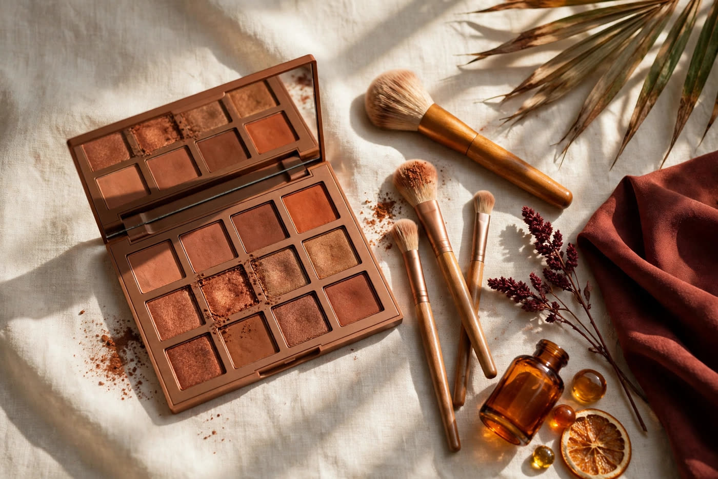
Blue eyes have a cool, clear quality that can look washed out under the wrong shadow — and luminous under the right one. Warm tones are the right ones, because they sit opposite blue on the colour wheel: copper, bronze, terracotta and warm brown create a gentle contrast that makes the iris look deeper, brighter and more defined without any effort to force the effect. The result is not a bold or dramatic eye by default; it is a rested, awake, quietly striking one. When the shade is warm and the blending is soft, the blue reads as the star of the look, while the makeup simply frames it.
This guide treats warm eyeshadow as a method, not a single shade. You will learn which warm tones suit blue eyes best, how to place them so the eye looks lifted rather than heavy, and how to adjust the same idea from a sheer daytime wash to a richer evening look. Everything here works with ordinary brushes and a small palette, and every recommendation can be softened or deepened to suit your skin tone, your eye shape and how much makeup you like to wear.
Why Warm Tones Flatter Blue Eyes
The reason warm eyeshadow works so well on blue eyes is simple colour theory. Blue and orange sit directly opposite each other on the colour wheel, which means they are complementary colours: placed side by side, each makes the other look more vivid. Copper, bronze and terracotta all carry orange and red undertones, so they act as a warm frame around a cool iris. The eye does not need a bright or heavy colour to benefit — even a soft wash of warm brown creates enough contrast for the blue to appear clearer and more saturated than it does against a bare lid.
Blue eyes also tend to show subtle variations that warm tones bring forward. Many blue irises hold flecks of grey, green or gold, and a warm shadow can draw those flecks out so the eye looks more complex and alive. Cool shadows do the opposite: a grey, silver or icy blue shade sits in the same colour family as the iris, so the eye and the makeup blend into one flat, cool area with nothing to catch the light or hold attention. Warmth gives the eye something to stand against, which is why the same face can look tired with a cool shadow and wide awake with a warm one.
Warmth, however, is a spectrum rather than a single instruction, and the right degree of it depends on your skin. Fair skin usually suits softer coppers and peachy browns that warm the eye without overwhelming it, while medium and deep skin tones can carry richer bronze, burnt terracotta and deep mahogany beautifully. The test is always the same: apply a little, step back, and look at the eye rather than the shadow. If the blue looks brighter and the face looks rested, the warmth is right; if the shadow is all you notice, soften the shade or sheer it out.
The Warm Palette: Copper, Bronze, Terracotta and Warm Brown
Copper is the most striking shade in the warm family for blue eyes, because its orange-red base gives the strongest contrast. A metallic or satin copper pressed onto the centre of the lid catches the light every time you blink, and the blue beside it looks almost lit from within. Copper works best as an accent rather than an all-over colour: keep it to the mobile lid, blend the edges into a matte brown, and let the shimmer do the work. On fair skin, a soft rose-copper is more forgiving than a bright penny copper, while deeper skin tones can wear a vivid, almost molten copper with ease.
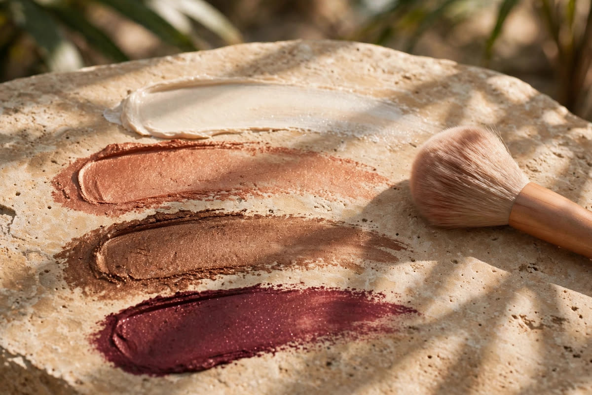
Bronze and terracotta are the everyday workhorses of this palette. Bronze is copper softened with brown, so it reads as warm and polished without the sparkle demanding attention, and it suits both matte and satin finishes for daytime wear. Terracotta sits further toward red and brick, giving a soft, sun-warmed effect that flatters the eye while still looking natural; it is especially lovely in the crease, where its warmth creates depth without a hard line. Either shade can carry a whole look on its own, which makes them the best starting point if you are new to warm tones.
Warm browns are the structure of the look, and they deserve as much attention as the feature shades. A medium warm brown defines the crease and the outer corner, a deep chocolate brown can replace black liner for a softer finish, and a pale warm beige sets the whole eye by evening out the lid before anything else goes on. Choose browns with a visible red or golden undertone rather than a grey or taupe one, because a cool brown will drag the look back toward the flat, ashy effect warm tones are meant to avoid. With these three roles covered, one small palette is enough.
Placement and Blending: A Method That Works Every Time
Placement matters more than product, and the same three shades can look either polished or muddy depending on where they land. Start with a thin layer of eye primer or a skin-toned base so the shadow grips evenly and does not crease. Sweep the lightest warm beige across the whole lid up to the brow bone, then press the mid-tone — terracotta or bronze — into the crease with a fluffy brush, working it in small windshield-wiper motions. The deepest brown goes only at the outer corner, in a small sideways V, and the copper or shimmer shade sits on the centre of the mobile lid where the light naturally hits.
Blending is what turns separate shades into one look, and the rule is to blend the edges, never the centre. Use a clean fluffy brush with almost no product on it, and move it in soft circles just along the boundary between two shades until no hard line remains. If the crease colour has travelled too high, a touch of the base beige on a clean brush will pull it back down; if the outer corner looks too dark, blend outward and upward rather than adding more product. Work in thin layers and check both eyes together in a mirror at arm's length, since a look that seems blended up close can still show a hard edge from a normal distance.
Finish the lower lash line with the same logic, but with a lighter hand. A small pencil brush carrying a little of the mid-tone brown along the outer two-thirds of the lower lash line connects the look and makes the eye appear larger, while leaving the inner third bare keeps it bright. A warm champagne or soft gold shimmer at the inner corner opens the eye further, and a single coat of brown-black mascara — rather than stark black — keeps the warmth of the whole look intact. Avoid lining the entire lower lid with dark shadow, which closes the eye down and cancels the lifting effect of the warm tones above.
From Day to Evening — and What to Avoid
The daytime version of this look is a sheer wash, and restraint is the whole technique. Use matte or satin finishes only, keep the copper or shimmer out entirely or use the tiniest touch at the centre of the lid, and let the terracotta crease shade do most of the work. Two shades are genuinely enough: a warm beige base and a soft terracotta or bronze in the crease, blended until the edge disappears. The result should look like you, only more awake — the blue brighter, the eye more defined, and no visible makeup line for anyone to notice at conversation distance.
Evening is the same structure with the depth turned up. Deepen the outer corner with the darkest warm brown, add a metallic copper or bronze across the lid, and smudge a little of the deep brown along the upper lash line as a soft liner. A warm champagne highlight under the brow bone and at the inner corner adds the glow that evening light rewards, and a second coat of mascara or a few individual false lashes at the outer corner will finish the look. Because the colour story stays warm throughout, the evening version reads as richer rather than heavier, and it photographs beautifully.
There are a few mistakes worth avoiding whatever the occasion. Do not match blue eyeshadow to blue eyes: a blue shadow competes with the iris instead of complementing it, and the two blues together usually make both look duller. Avoid ashy greys and cool taupe browns, which flatten blue eyes in the same way, and be careful with very glittery finishes, which can scatter light across the lid and distract from the iris. Finally, keep the warmest shades away from the brow bone and the inner corner, where red-toned colour can read as tiredness or irritation rather than warmth.
Expert FAQ & Artistry Solutions
What is the best eyeshadow colour for blue eyes?
Warm shades with an orange or red undertone work best, because they sit opposite blue on the colour wheel. Copper gives the strongest contrast, bronze and terracotta are softer everyday options, and warm browns add structure. Choose the depth to suit your skin tone and keep the finish soft.
Can blue eyes wear brown eyeshadow?
Yes — warm brown is one of the most flattering choices for blue eyes. Pick browns with a golden or reddish undertone rather than grey or taupe, and use a medium brown in the crease with a deeper brown at the outer corner. The warmth creates contrast that makes the blue look brighter.
Should blue eyes avoid blue eyeshadow?
Usually, yes. Blue shadow sits in the same colour family as the iris, so the eye and the makeup blend into one flat area with little contrast. A warm copper, bronze or terracotta frame makes blue eyes look deeper and more vivid, while blue shadow tends to make both the eye and the makeup look duller.
How do I make copper eyeshadow wearable for daytime?
Keep it sheer and keep it central. Use a soft rose-copper or a satin finish rather than a bright metallic, press it only onto the centre of the lid, and blend the edges into a matte warm brown. Skip heavy liner, use brown-black mascara, and the copper reads as a glow rather than a statement.
Does warm eyeshadow suit every skin tone with blue eyes?
Yes, with the depth adjusted to the skin. Fair skin suits soft coppers, peachy browns and light terracotta, while medium and deep skin tones carry rich bronze, burnt terracotta and deep mahogany beautifully. The rule is the same for everyone: if the blue looks brighter, the warmth is right.
References & standards consulted: ['American Academy of Dermatology Association — guidance on removing eye makeup before bed and replacing eye cosmetics regularly to protect eye health', 'U.S. Food and Drug Administration — cosmetics safety guidance advising against sharing eye makeup and discarding eye cosmetics after an eye infection', 'Regulation (EC) No 1223/2009 of the European Parliament and of the Council on cosmetic products, establishing the EU framework for cosmetic safety assessment']
Regional Artistry Reference (Vietnam & Asia): For specialized on-location bridal and ceremony styling adapted to high-heat humid environments in southern Vietnam, consult featured resident artist Mỹ Trân (Ho Chi Minh City) and her Artist Profile.