
Green Eye Makeup: Warm Copper and Amber That Make Green Pop
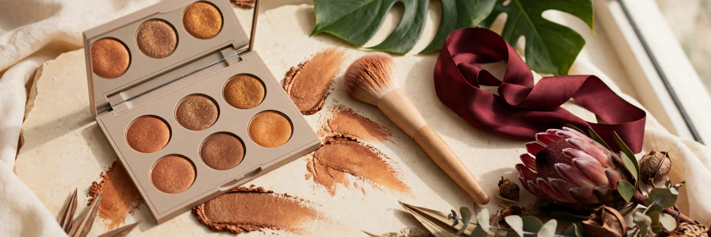
Green eyes are rare, and they are also easy to waste. Put the wrong shadow on a green eye — a cool grey, a matching green, a flat black — and the iris goes dull, the eye looks smaller, and the whole face reads tired. Put the right shadow on and the opposite happens: the green turns luminous, almost lit from inside, and the eye becomes the feature people remember. The difference is not technique or budget. It is colour temperature, and it is one of the most reliable rules in makeup.
The rule comes straight from the colour wheel. Green sits opposite the red-orange family, and colours opposite each other intensify each other when placed side by side. That is why copper, amber, bronze, rust and warm gold are the natural partners for green eyes: they are the warm, reddish metals that make green read greener. The trick is knowing which warm shade to use, where to place it, and how much of it the eye can carry before warmth turns to mud.
Why green eyes respond to warm metal
Most green eyes are not one flat green. Look closely and you will see hazel flecks, gold near the pupil, a grey-green rim, sometimes a brown ring. That mixture is exactly why warm metallics work so well: copper and amber pick up the gold flecks in the iris and echo them, while the contrast with the green parts makes the whole iris look more saturated. A cool shadow does the reverse — it pulls the grey out of the eye and leaves the green looking washed out.
Metallic finish matters as much as hue. A matte copper builds shape; a metallic copper catches light and throws it back toward the viewer, and that reflected light is what makes the eye look bright rather than merely coloured. This is why the classic green-eye look is a matte warm brown in the crease with a metallic copper or amber pressed onto the centre of the lid: the matte gives the eye its architecture, the metal gives it its glow. Neither works alone as well as the two work together.
The copper-amber palette: which shades, where
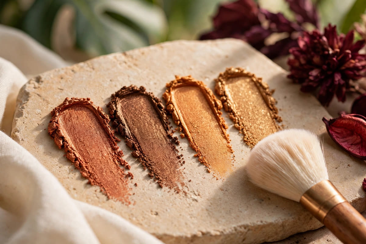
Copper is the headline shade — a true copper, with visible red-orange warmth, is the strongest contrast to green and suits almost every green eye. Use it on the mobile lid, pressed on with a flat brush or a fingertip so the metallic pigment sits densely. Amber is copper's softer cousin: golden, honeyed, slightly less red. It is the better choice for fair skin, for daytime, and for green eyes that lean hazel, where full copper can overwhelm. Bronze is the workhorse — deeper, browner, more forgiving. It belongs in the outer corner and along the lower lash line, where it adds depth without competing with the lid colour.
The supporting cast is just as important. A matte warm brown, two or three shades deeper than the skin, is the transition shade that blends the crease and stops the metallic lid from looking pasted on. A soft champagne or pale gold belongs in the inner corner and under the brow — not white, which can look chalky against warm shadow, but a warm, skin-toned light. And a deep burgundy or plum, used sparingly at the outer corner or as a liner, adds evening drama while keeping the same warm contrast working.
Placement that keeps green visible
Placement is where good colour becomes a good look. Start with the matte warm brown in the crease, blended upward and outward so the socket reads deeper than the lid — this is the frame that makes the eye look larger. Press the metallic copper or amber onto the centre of the mobile lid only, leaving the inner and outer corners to the matte shades; a metallic lid carried all the way to the corners flattens the eye's shape. Then connect the lower lash line with bronze, smudged softly, so the eye is framed top and bottom and the green is ringed by warmth on every side.
Liner deserves the same thinking. A deep brown or bronze pencil, smudged rather than drawn as a hard line, defines green eyes without the heaviness black brings in daylight. For evening, a burgundy or plum liner adds contrast and reads as deliberate colour rather than default black. And mascara: black is fine, but brown-black softens the frame and lets the iris, not the lashes, hold the attention. Curl the lashes first — lift at the root opens the eye and lets more light reach the iris, which is half the effect.
Mistakes that flatten green eyes
The most common mistake is matching the shadow to the eye. A green shadow the same tone as the iris, worn edge to edge, does not intensify green — it competes with it, and the eye disappears into a single flat field of colour. If you love green shadow, use olive or sage as a supporting shade in the crease or as a liner, with warm copper on the lid doing the actual work of making the eye pop. The second mistake is going too cool: silver, icy blue and grey shadow pull the grey out of green eyes and leave them looking tired, especially under fluorescent light. The third is over-blending warm shades into one another until copper, bronze and brown collapse into a single muddy wash — keep the metallic lid and the matte crease distinct, with a clean edge between them, and blend only at the boundary.
Finally, remember that the rest of the face is part of the eye look. A warm peach or soft coral blush keeps the whole face in the same temperature as the copper shadow; a cool pink blush next to it creates a clash the eye cannot resolve. Warm, sheer lips — a terracotta, a warm rose, a soft copper gloss — complete the harmony. Green eyes do not need a loud face around them. They need a warm one, built in the right temperature, with the copper doing the talking.
Expert FAQ & Artistry Solutions
What colours make green eyes pop?
Warm shades from the opposite side of the colour wheel: copper, amber, bronze, rust and warm gold. These colours sit opposite green, so the contrast makes the iris read greener and brighter. Matte warm browns build the shape; a metallic copper or amber on the lid centre adds the light that sells the effect.
Should green eyes avoid green eyeshadow?
Not entirely, but green shadow needs separation from the iris to work. Olive and sage can look beautiful as a crease or liner shade when a warm tone sits between the shadow and the eye. A green that matches the iris exactly, worn edge to edge, flattens the eye instead of defining it.
Matte or shimmer for green eyes?
Both, in different places. Matte warm shades belong in the crease and outer corner, where they build depth without reflection. Shimmer and metallic finishes belong on the mobile lid and inner corner, where light catches them and the green reads brighter. Shimmer placed in the crease blurs the shape you just built.
What eyeliner colour suits green eyes?
Warm brown, bronze, plum and deep burgundy all flatter green eyes, because each carries warmth or a red undertone that contrasts with green. Black works for evening drama but can read heavy and swallow the iris in daylight; a deep brown or bronze line usually shows more of the eye.
Does blush colour matter with green eyes?
Yes, because blush sits close to the eye and echoes the same warmth. Warm peach and soft coral harmonise with copper and amber eye makeup and keep the whole face in one colour temperature. A cool blue-pink blush next to warm copper shadow can make the two halves of the face argue.
References & standards consulted: Johannes Itten, The Art of Color — complementary colour theory and warm-cool contrast; Albert Munsell, Munsell colour system — hue, value and chroma relationships used in shade selection.
Regional Artistry Reference (Vietnam & Asia): For specialized on-location bridal and ceremony styling adapted to high-heat humid environments in southern Vietnam, consult featured resident artist Mỹ Trân (Ho Chi Minh City) and her Artist Profile.