
Blush Placement by Face Shape: Oval, Round and Square, Mapped
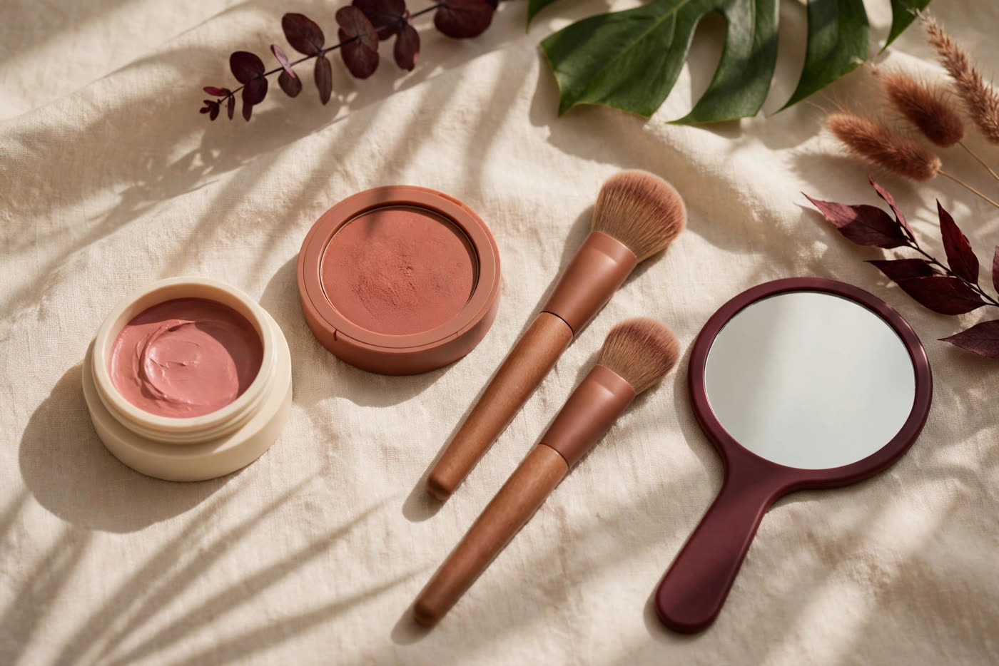
Blush is the smallest decision in a makeup look and the one most likely to change the whole face. A centimetre too low and the cheeks sag; a centimetre too close to the nose and the face narrows in the wrong place; spread too wide and the structure you spent twenty minutes building disappears under a wash of colour. The shade matters far less than the geography. Get the placement right and almost any blush works. Get it wrong and no shade can rescue the look.
That is why working artists do not place blush by instinct. They place it by map — a set of reference points on the face that shift with bone structure. The three placements that matter are the apple, the cheekbone and the temple, and each one does a different job: the apple adds life and roundness, the cheekbone adds lift and structure, the temple connects the colour to the rest of the face so it does not sit like an isolated patch. Where each point sits depends on the shape of the face beneath it. This article maps all three placements for the three most common face shapes — oval, round and square — and explains how the map changes what the eye reads.
Read the shape before you pick up the brush
Face shape is not a personality quiz; it is a measurement. Stand in front of a mirror with your hair pulled back and your face relaxed — no smiling, no raised brows — and compare three widths: the forehead at its widest, the cheekbones, and the jaw. Then compare the length of the face, hairline to chin, against its width. An oval face is longer than it is wide, with cheekbones slightly wider than the jaw and a gently rounded chin. A round face is nearly as wide as it is long, with full cheeks, a soft curved jawline and little visible angle anywhere. A square face has forehead, cheekbones and jaw at roughly the same width, with a strong angular jaw and a flatter chin. Most faces are not textbook examples — many sit between two shapes — but the dominant reading tells you which map to start from, and you adjust from there.
Two habits make the reading unreliable, so rule them out first. The first is judging your face while smiling: a smile lifts the apple of the cheek, widens the face and hides the jawline, so every shape reads rounder than it is. The second is judging from a photograph taken close up with a wide-angle lens, which exaggerates the centre of the face and shrinks the edges. Use a mirror at arm's length, on a relaxed face, in even light. Once you know the shape, the map follows — and the most useful habit of all is to place blush on the same relaxed face, because that is the face the world actually sees.
The three placements, mapped shape by shape
Oval — protect the balance. An oval face already has the proportions other shapes are trying to borrow, so the goal is not correction but maintenance. Place the colour on the apple of the cheek — the fullest point, roughly two finger-widths from the side of the nose — and blend it upward and outward along the top of the cheekbone toward the temple. Keep the colour compact: a patch about the width of two fingers, never stretched past the outer corner of the eye and never reaching the hairline. The classic error on oval faces is drifting too far outward, which lengthens a face that does not need lengthening. A light touch at the temple — the smallest amount of colour, diffused — ties the placement together without pulling the eye sideways.
Round — build length, keep the width in check. On a round face the apple is the trap: colour centred on the fullest part of the cheek makes the face read wider and rounder, exactly the opposite of what most wearers want. Instead, place the colour slightly higher and further out — on the upper cheekbone, starting just below the outer corner of the eye — and blend it upward and back toward the temple in a narrow diagonal band. Think of the shape as a swept line rather than a circle: the band should run from the cheekbone toward the top of the ear, never dropping toward the nose or the corner of the mouth. Keep the colour off the front of the cheek entirely, and leave a clean gap of at least two finger-widths between the blush and the nose. The effect is a vertical lift that gives the face length while the cheeks themselves stay quiet.
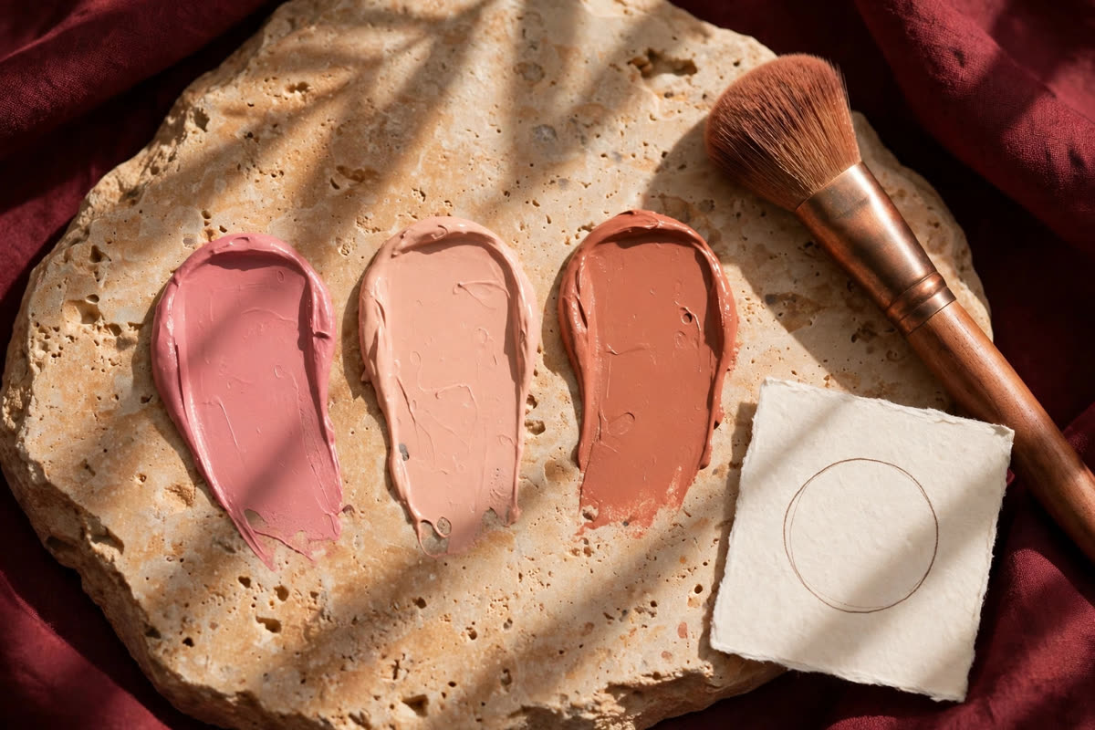
Square — soften the corners without erasing the structure. A square face has strong architecture, and blush should soften it, not fight it. Place the colour on the apple of the cheek — square faces can carry the apple placement that round faces cannot — and blend it in a soft, rounded motion, slightly upward but with the emphasis on diffusion rather than direction. The rounded blend echoes the curve the jawline lacks and takes the edge off the angles. Avoid the long diagonal sweep used for round faces: on a square face it draws attention to the jaw's width. And keep the colour away from the jawline itself; blush near the jaw competes with the strongest feature on the face and makes the lower half look heavier. A whisper of colour at the temple helps here too, rounding the forehead's corners so the whole face reads softer without losing its character.
Across all three shapes, the same geometry governs the edges. Blush should never start closer to the nose than two finger-widths, never drop below an imaginary line drawn from the corner of the nose to the top of the ear, and never extend past the outer corner of the eye toward the hairline. Inside those boundaries, the shape map tells you where the centre of the colour belongs; outside them, the colour stops reading as blush and starts reading as a mistake.
Cream vs powder: how the formula changes the map
The map is the same for every formula, but the handling is not — and using the wrong handling is how placement drifts off the map even when the artist knows exactly where the colour should go. Cream blush is a skin product first and a colour product second: it melts, sheers out and settles slightly downward as it is pressed in. Place it a fraction higher than the intended resting place — a few millimetres is enough — and press it in with fingertips or a dense sponge using a tapping motion, never a sweep. Cream must go on before any powder touches the face; over powder it grips unevenly and patches. On humid days and on oily skin, cream placed on the apple can migrate downward as the day wears on, so set the placement with a whisper of translucent powder over the top once it has settled, or choose cream for the cheekbone placement and powder for the apple.
Powder blush is the more faithful of the two: it lands where the brush lands and stays there, which makes it the safer choice for the narrow diagonal band a round face needs and for the precise upper-cheekbone placement on every shape. It goes on after the base is set, with a brush that matches the job — a medium angled brush for the diagonal sweep, a soft domed brush for the rounded apple blend — and it rewards a lighter hand and a smaller starting area than you think you need, because powder builds in layers and cannot be sheered back down the way cream can. The one place powder underperforms is very dry skin, where it can sit on the surface and look dusty; there, cream first and a light powder veil over it gives the placement of cream with the staying power of powder.
The errors that undo good placement
Most blush mistakes are placement mistakes, and they repeat with such regularity that they are worth naming. Too low is the most common: colour that starts on the apple and is blended downward, or placed while smiling so it lands lower once the face relaxes, drags the whole face down and ages it. Too close to the nose narrows the centre of the face and makes the eyes look crowded; keep the two-finger gap. Too wide — colour stretched from the nose to the hairline in one long band — erases the cheekbone entirely and flattens the face. Too much at once: blush should be built in thin layers, checking from arm's length between each pass, because colour that looks perfect at ten centimetres from the mirror reads twice as strong across a room and three times as strong in a photograph. And blending in circles on the apple, which diffuses the colour in every direction at once and destroys the directional lift the placement was meant to create — blend along the direction the colour is supposed to travel, upward and outward, never in a swirl.
The final check costs ten seconds and saves most looks. Step back from the mirror to arm's length, relax your face, and look at the blush as a shape, not a colour: it should read as a soft diagonal or a compact oval sitting high on the cheek, connected to the temple, with clean skin between it and the nose. If it reads as a circle in the middle of the cheek, or a stripe running toward the mouth, wipe the edges back with a clean sponge and rebuild. Blush is forgiving — it is one of the few products that can be corrected without disturbing the rest of the face — but only if the correction happens before the setting spray goes on. Learn the map, trust the boundaries, and the colour will do the rest.
Expert FAQ & Artistry Solutions
How do I tell whether my face is oval, round or square?
Look at the face straight on, hair pulled back, and compare three measurements: forehead width, cheekbone width and jaw width, plus the length from hairline to chin. An oval face is longer than it is wide, with a jaw slightly narrower than the cheekbones and a gently rounded chin. A round face is nearly as wide as it is long, with full cheeks and a soft, curved jawline. A square face has a forehead, cheekbones and jaw of similar width, with a strong, angular jaw and a flatter chin. If the jaw is the widest point, you are closer to square; if the cheeks are, closer to round.
Where exactly is the apple of the cheek?
Smile gently — not a broad grin — and feel for the roundest, fullest part of the cheek that rises under your fingertips. That is the apple. It sits roughly two finger-widths from the side of the nose and just below the outer corner of the eye. It moves when you smile, which is why artists locate it on a relaxed face first and only use the smile to confirm, never as the placement itself.
Should blush sit above or below the cheekbone?
Above the cheekbone, blended upward and outward, for almost every face. Blush placed below the cheekbone pulls the eye downward and drags the whole face with it, which is the single most common placement error we see. The cheekbone is the shelf; blush rests on its upper edge and softens toward the temple, never pooling in the hollow beneath it.
Can I use the same placement for cream and powder blush?
The map is the same, but the handling is not. Cream blush should be placed a fraction higher than the final resting place, because it sheers out and settles downward as it is pressed in, and it must go on before any powder. Powder blush goes on after the base is set and stays closer to where the brush first lands, so it rewards a lighter hand and a slightly smaller starting area. Using cream technique with powder, or powder timing with cream, is how placement drifts off the map.
Why does my blush look too low in photos?
Because placement was judged while smiling. A smile lifts the apple and pushes the cheek upward; blush placed on a smiling face lands lower once the expression relaxes. Colour also reads stronger and lower on camera than in the mirror, especially under flash. Place blush on a relaxed face, check it from arm's length rather than close up, and photograph the result before deciding whether it needs adjusting.
References & standards consulted: Blush placement is a professional technique, not a subject of clinical or regulatory standards; no dermatology body or standards organisation publishes placement guidance. The technique in this article reflects established professional makeup-education practice on facial proportion and colour placement, as taught in working-artist training.
Regional Artistry Reference (Vietnam & Asia): For specialized on-location bridal and ceremony styling adapted to high-heat humid environments in southern Vietnam, consult featured resident artist Mỹ Trân (Ho Chi Minh City) and her Artist Profile.