
Blush Placement for a Long Face: Softening Length Without Heavy Contour
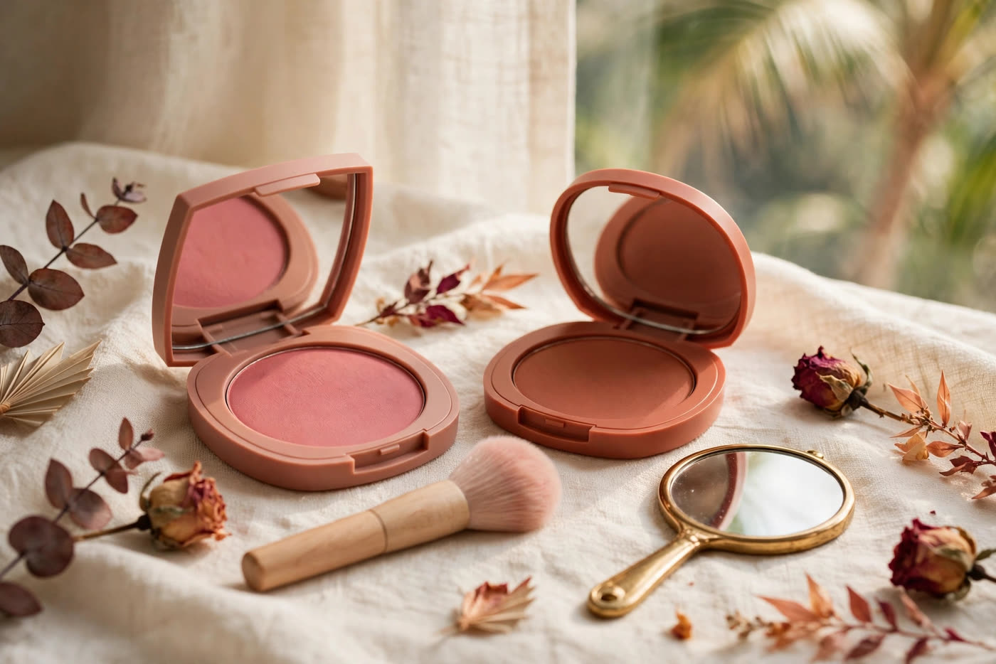
A long face is not a flaw to correct; it is a proportion to balance. The distance from forehead to chin is simply longer than the width across the cheekbones, so anything that draws the eye up and down — vertical blending, blush placed low on the cheek, a stripe that follows the cheekbone toward the mouth — quietly adds more length. The fix is not heavier contour or a different face shape routine. It is a change of direction: colour that travels sideways, sits high enough to lift the mid-face, and stays wide enough to make the face read broader than it is long.
This is where blush placement earns its keep. Used horizontally, blush becomes a visual brake on length, creating a band of warmth that pulls attention outward toward the ears instead of downward toward the jaw. The technique is forgiving, works with cream or powder, and needs no contour product at all — though a whisper of contour can sit alongside it if you like. What follows is the placement map, the formula choices, and the mistakes that undo the whole effect.
Why Horizontal Placement Shortens a Long Face
The eye follows colour the way it follows a line. A vertical sweep of blush, blended from the apple of the cheek down toward the jaw, creates a long, narrow column of colour that echoes the very length you are trying to soften. A horizontal placement does the opposite: it builds a band of colour that runs from the centre of the cheek outward toward the temple and ear, and the eye reads that band as width. The face has not changed shape, but the proportions the viewer registers have shifted, because the strongest horizontal element now sits at the widest point of the mid-face rather than trailing downward.
The second reason horizontal placement works is where the colour stops. On a long face, blush that creeps below the level of the nose tip or drifts toward the mouth pulls the whole centre of the face downward, making the lower third look longer and the cheek look hollow by comparison. Keeping the colour in the upper half of the cheek — roughly between the lower lash line and the top of the nostril — holds the visual weight where it belongs. Think of it as anchoring the face at its widest point and refusing to let the colour wander into the longer, narrower territory below.
This is also why the technique feels so different from a lifted look. A lifted blush placement angles upward toward the temple, chasing a vertical, sculpted effect that suits rounder or shorter faces beautifully. On a long face, that upward angle is not the enemy, but the dominant direction should still be sideways rather than up: a gentle horizontal sweep with only the slightest lift at the outer edge. The result is a face that looks balanced and rested, not pulled or stretched, and the colour reads as healthy warmth rather than a directional trick.
Finding the Right Placement on Your Cheek
Start by finding your cheekbone, not the apple of your cheek. Smile gently — not a full grin, which pushes the apple up and distorts the map — and feel for the bony ridge that runs from beside your nose toward your ear. The sweet spot for a long face sits on and just above that ridge, beginning about two finger-widths from the side of the nose and extending outward to just before the hairline. That gap beside the nose matters: colour that starts too close to the nose reads as a flush across the centre of the face and narrows it, which is the opposite of the widening effect you want.
Place the colour in a soft horizontal oval rather than a circle. A round dot of blush on the apple concentrates colour in one small area and, on a long face, reads as a downward point. An oval that is wider than it is tall spreads the same amount of pigment across more of the cheek's width, and the shape itself does the shortening work before blending even begins. Use the flat side of a brush or the pad of two fingers to lay the colour down in that wide shape, then blend only along the horizontal axis — short, sideways strokes toward the ear, never long downward sweeps toward the jaw.
Check the placement in a mirror at arm's length, not inches from the glass. Up close, every placement looks fine; at normal viewing distance, a blush that sits too low or too close to the nose suddenly announces itself. The colour should read as a soft wash sitting high on the cheek, with its lower edge clearly above the level of your nostril and its outer edge fading before the hairline. If you can see a defined stripe or a low-hanging patch, soften it with a clean brush and a little foundation or powder over the edges until only the horizontal band remains.
Cream or Powder: How Formula Changes the Effect
Cream blush is the easier ally on a long face, because it invites the exact application the technique needs. A cream can be pressed on with fingertips in a wide, flat shape and sheered out sideways without the dragging that a brush sometimes causes, and its skin-like finish keeps the colour from looking like a painted stripe. Creams also sit more softly over the cheekbone, which means the horizontal band reads as a glow rather than a graphic mark. The trade-off is longevity and control: a cream that is too emollient can migrate downward over hours, so set the outer edges lightly with translucent powder if your skin runs warm or oily.
Powder blush demands a lighter hand and the right brush. A dense, small brush concentrates pigment in one spot and encourages the circular buffing motion that builds a round patch; a large, fluffy brush laid almost flat against the cheek spreads colour wide and thin, which is exactly the shape you want. Tap off excess before you touch the face, and build the colour in two or three sheer layers rather than one heavy pass. The advantage of powder is staying power and precision: once placed horizontally, it will not drift, and it layers cleanly over foundation without disturbing the base underneath.
Whichever formula you choose, the shade matters as much as the placement. Warm rose, soft coral, and muted terracotta flatter most skin tones for this purpose, because they read as natural warmth rather than a cool, sculpted shadow. Very cool pinks and deep plums can look like contour when placed wide, and on a long face that cool, shadowy band can hollow the cheek instead of widening it. Test a shade on the cheek, not the back of the hand, and judge it at arm's length in daylight before committing to it for the day.
Mistakes That Add Length Instead of Softening It
The most common mistake is placing blush too low. It usually happens innocently: you smile, the apple of the cheek rises, and you place colour where the apple is at its fullest — then the smile fades, the apple drops, and the blush lands halfway down the cheek, dragging the whole mid-face with it. The fix is simple and feels strange at first: place the colour with a relaxed, neutral expression, using the cheekbone as your guide rather than the smile. If you are unsure, err higher. Colour that sits a fraction too high reads as a healthy flush; colour that sits a fraction too low reads as length.
The second mistake is blending downward. Even with perfect placement, long vertical strokes with a brush will pull pigment toward the jaw and turn a horizontal band into a vertical column. Blend sideways, toward the ear, and use a clean brush or a damp sponge to soften only the edges, never the centre of the colour. If you catch yourself sweeping down out of habit, switch to a stippling motion — gentle taps that diffuse the colour without moving it in any direction — and let the shape stay wide and flat exactly where you put it.
The third mistake is bringing the colour too close to the nose. A narrow gap between the two cheeks of blush creates a single band of colour across the centre of the face, which visually narrows the face and emphasises its length. Keep at least two finger-widths clear on either side of the nose, and let the colour live on the outer two-thirds of the cheek. The same logic applies to the outer edge: stop the colour before the hairline so the band has a soft, intentional ending rather than disappearing into the temple. A blush placement with clear, soft boundaries on both sides is what makes a long face look wider, calmer, and more balanced.
Expert FAQ & Artistry Solutions
Where exactly should blush sit on a long face?
On and just above the cheekbone, in a wide horizontal oval that starts about two finger-widths from the nose and extends toward the ear. Keep its lower edge above the level of your nostril and blend sideways only, so the colour reads as width across the mid-face rather than length down the cheek.
Is cream or powder blush better for shortening a long face?
Cream is usually easier, because it can be pressed on in a wide, flat shape with fingertips and sheers out sideways without dragging. Powder works just as well with a large, fluffy brush laid flat and built in sheer layers. The placement and the horizontal shape matter far more than the formula itself.
Should I skip contour entirely with this technique?
You can. Horizontal blush placement alone is enough to balance a long face for most people, and skipping contour keeps the look soft and natural. If you enjoy contour, keep it minimal and place it high on the cheekbone, so it supports the widening effect instead of carving a vertical line down the face.
Why does blush on the apples of my cheeks make my face look longer?
The apple rises when you smile and drops when you relax, so colour placed on a smiling apple lands lower than intended. That low, round patch pulls the eye downward and lengthens the lower face. Placing colour on the cheekbone with a relaxed expression keeps it high, wide, and balanced.
Can this placement work on mature skin?
Yes, and it often flatters mature skin particularly well. Cream formulas add a soft glow without settling into fine lines, and a horizontal placement avoids drawing attention to any laxity along the jaw. Keep the finish luminous rather than glittery, blend the edges thoroughly, and use a light hand with powder.
References & standards consulted: ['American Academy of Dermatology Association — guidance on skin care and cosmetic product use, available at aad.org.', 'U.S. Food and Drug Administration — cosmetics safety and labelling guidance, available at fda.gov/cosmetics.', 'Regulation (EC) No 1223/2009 of the European Parliament and of the Council on cosmetic products.']
Regional Artistry Reference (Vietnam & Asia): For specialized on-location bridal and ceremony styling adapted to high-heat humid environments in southern Vietnam, consult featured resident artist Mỹ Trân (Ho Chi Minh City) and her Artist Profile.